Quarantine
An Exercise in Type Design

INSPIRATION
During my stay at home during this COVID-19 outbreak, I have spent a lot of time walking my dog in circles around my apartment building. I currently live in an old middle school that was converted to apartments. The Art Deco architecture and decorative motifs are from my favorite period and style. As I took trip after trip around the building covered by the cloudy, gray skies of Pittsburgh, I found myself inspired to start a project I’ve always meant to but never had the time for. QUARANTINE is the very first iteration of a typeface I hope to continue developing. While it is far from complete, having only done a cursory attempt at my capitals, I felt a sense of accomplishment in the midst of a difficult situation that has made this initial effort worthwhile.

SKETCHING
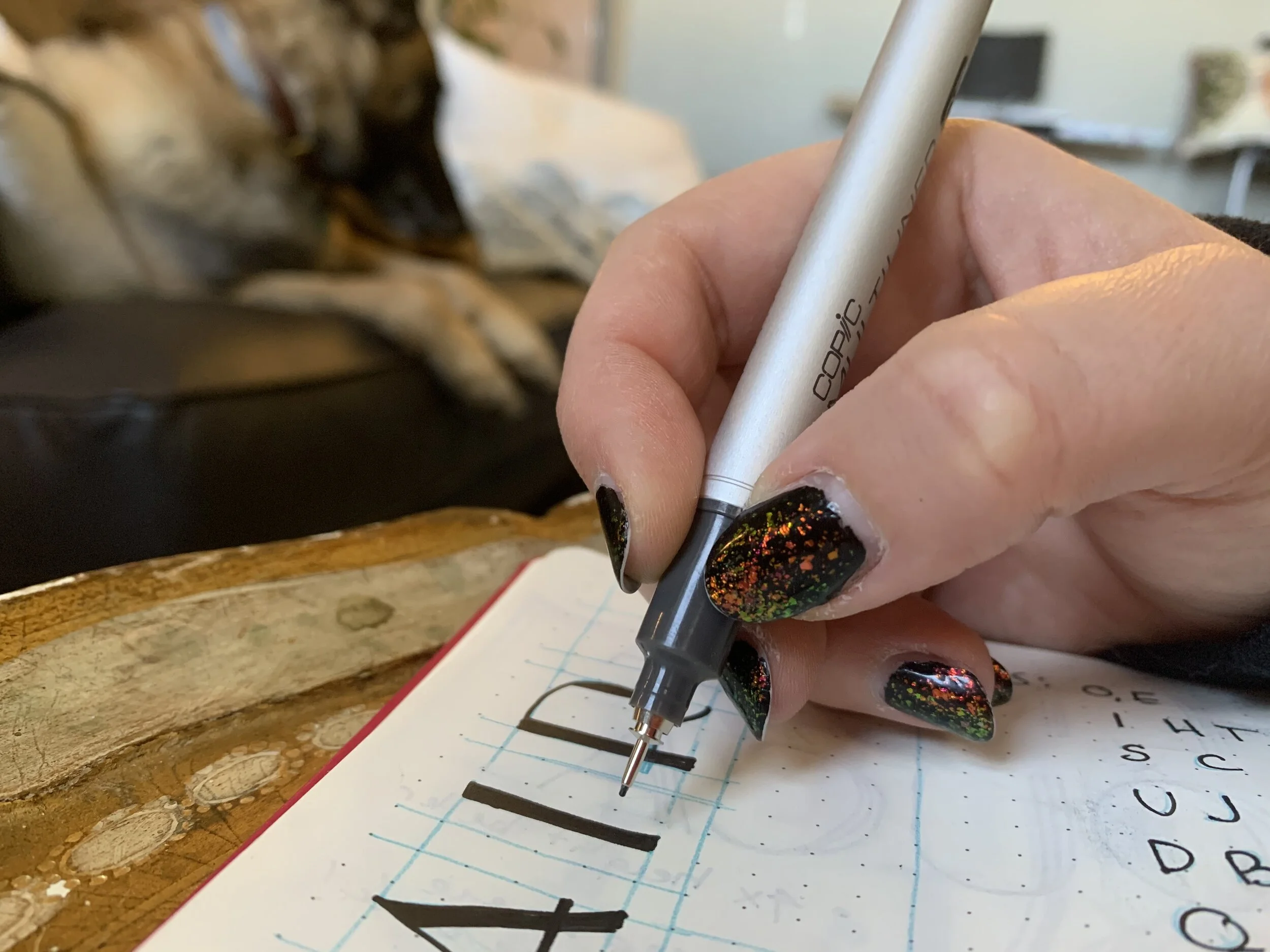
I began by doodling during remote meetings (doodling has always helped me concentrate). I then settled on a basic style that I wanted to continue exploring, and began crafting my letterforms in more detail.
DEVELOPING
I utilized one of my favorite reference books, Designing Type by Karen Cheng, as well as my experience doing Roman Broad calligraphy to work out the letters’ relative height, width, and proportions. Once I had drafted all 26 letters, I scanned my drawings and moved to digitizing them.

DIGITIZING
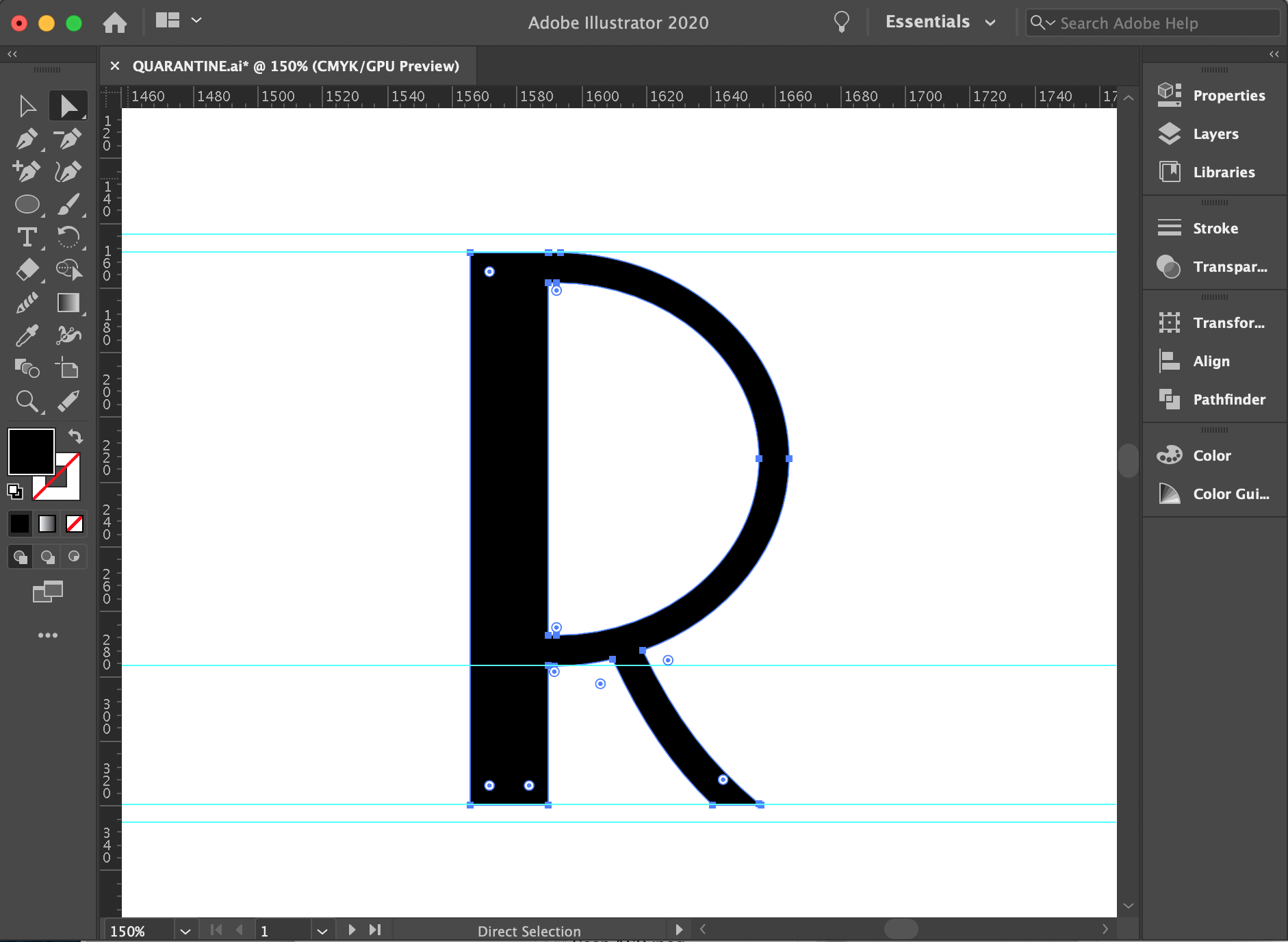
I imported all of my scans into Adobe Illustrator, my personal favorite for producing vector illustrations, and digitized all 26 letters. I added a long shadow which called to mind both the grey Pittsburgh skies as well as the black and white high-contrast cinematography of the 1920’s.
FUTURE ITERATIONS
The development of this typeface has only just started. I will continue to revisit a few letterforms to correct them optically, and then move on to establishing kerning. In addition to creating lowercase forms, numbers, and punctuation, I also need to establish italic and bold forms in order for this to become a typeface, and not simply a single font.